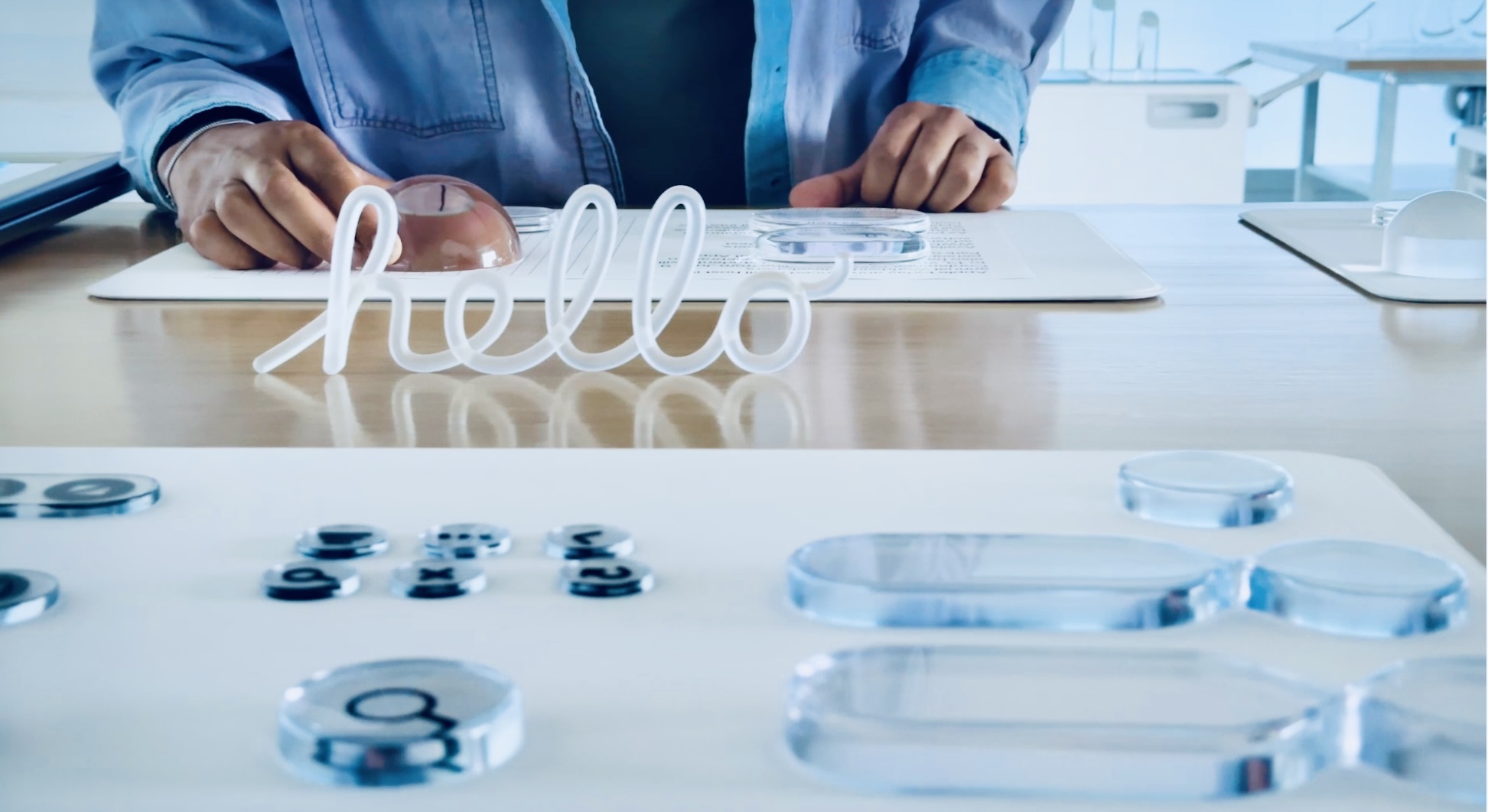
Apple’s Liquid Glass design is a new user interface style introduced at WWDC 2025 as Apple’s “broadest software design update ever”. Despite the name, it’s not about physical hardware materials – it’s a software design language that gives UI elements a glass-like appearance. Apple describes Liquid Glass as a translucent, dynamic material in the interface that “reflects and refracts its surroundings” and adapts fluidly to content and context. In practice, this means menus, buttons, panels, and other UI components have a sleek translucence and shine, almost as if they were made of real glass. The design was inspired by the 3D, layered interface of visionOS (for Apple’s Vision Pro headset), bringing a sense of depth and dimensionality to 2D screens.
Apple’s Alan Dye (VP of Human Interface Design) says Liquid Glass “combines the optical qualities of glass with a fluidity only Apple can achieve” – creating “moments of beauty, craft and joy” in everyday interactions.
Key characteristics of Liquid Glass include: translucent glass-like layers for controls and surfaces, real‑time lighting effects (specular highlights) that make elements reflect and shine as the device or content moves, and dynamic coloringthat responds to context. For example, the material tints itself light or dark based on ambient background, ensuring it remains legible in both modes. In essence, Liquid Glass is Apple’s new visual language across its software – a move away from flat design toward a richer, context-aware look. It’s similar conceptually to past translucency in UIs (like iOS 7’s frosted glass or even Windows’ Aero Glass), but Apple pushes it further with more realistic rendering and continuous adaptation.
Importantly, Liquid Glass is meant to feel “instantly familiar” to users – Apple kept core icons and layouts recognizable – while still refreshing the aesthetic.
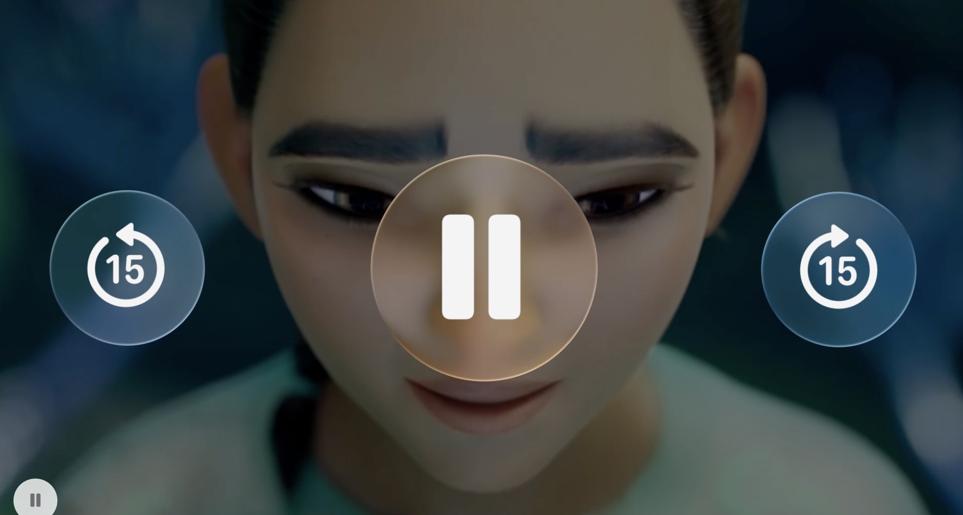
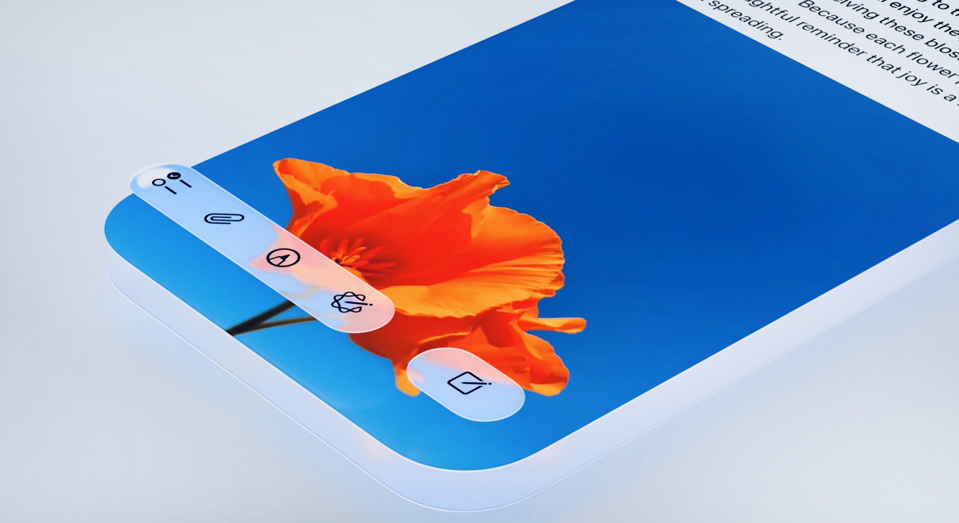
Liquid Glass spans across the Apple ecosystem. Starting with the upcoming iOS 26 (and similarly numbered iPadOS 26, macOS “Tahoe” 26, watchOS 26, and tvOS 26), the entire interface adopts this design. On the iPhone and iPad, you’ll see it in app toolbars, navigation bars, widgets, and even the Lock Screen. For instance, iOS 26’s tab bars are now made of Liquid Glass – when you scroll content, the tab bar shrinks and turns more transparent to emphasize the content, then fluidly expands again when you need it. Sidebars in iPadOS and macOS use the new material to refract the content behind them and reflect a bit of the wallpaper, so users always sense what’s behind the panel. System overlays like Control Center, notifications, and widgets all have a glassy layer quality. Even the clock on the Lock Screen is “crafted out of Liquid Glass” and dynamically positions itself behind the subject of your wallpaper photo – a visually striking effect that integrates the time display with your image.
On macOS Tahoe 26, Apple has taken the opportunity to add more personalization with this design. The Dock, app icons, and widgets are rendered in multiple layers of Liquid Glass, with shiny highlights and the ability to tint them with color or make them almost completely clear. Users can choose a bright tint, a dark translucent look, or an “elegant new clear look” for the desktop, as well as enjoy a fully transparent menu bar for an immersive effect. This means your Mac’s interface can either subtly blend with your wallpaper (for example, a clear Dock that reflects the colors of the background) or stand out with a chosen accent color – all while maintaining a glassy, layered feel.
Even smaller devices benefit: on Apple Watch (watchOS 26), menus and alerts use translucent panels that overlay the watch face, and dynamic typography that scales and shifts to enhance depth. Apple TV’s tvOS 26 also adopts the style for its interface, bringing consistency in visuals from the biggest screen to the smallest. Apple has emphasized that this unified design harmonizes the experience of moving between devices – a button or menu on Mac now looks and behaves analogous to its counterpart on iPhone or Watch. This cross-device continuity is intentional: as one design journalist noted, all platforms are now “united by a new aesthetic approach, Liquid Glass,” achieving a visual parity that makes using multiple Apple products more seamless.
It’s worth noting that Liquid Glass isn’t purely cosmetic. It also influenced how controls behave. Apple redesigned interface components to be more fluid and context-aware. For example, buttons and toggles made of Liquid Glass can “morph” their shape or opacity when needed, literally giving way to content when appropriate. Modals and menus in iOS 26 reportedly float in more gently and naturally than before. This ties into the overall philosophy of making the UI feel like layers of physical glass: elements have a sense of weight and space, and transitions are smoother (Apple even updated its system motion curves for a more natural feel).
Apple’s own apps are being updated to showcase Liquid Glass. The Music app, Photos, Safari, and others have new designs that use translucent toolbars and floating cards over content. In Apple Music, for example, the playback controls sit on a frosted-glass panel that slightly reveals the album art colors behind it. The design does come with challenges, early beta testers noticed that in some cases (like Apple Music’s playlist view), the text (e.g. song or artist name) on a translucent background could be low-contrast and hard to read. Apple will likely refine these details before final release. Indeed, the initial developer beta of iOS 26 had some rough edges in the UI, which Apple acknowledged and is expected to polish.
Overall, Liquid Glass is being applied pervasively to create a cohesive look, and even hardware plans seem to echo the theme, there are rumors of a future “Glasswing” iPhone with curved glass edges in 2027 that will physically embody the Liquid Glass look in hardware design. For now though, Liquid Glass refers to Apple’s software design language, not a literal liquid-infused glass material.
Apple’s Liquid Glass design brings a bold visual refresh, but how does it fare in terms of classic usability principles like Nielsen’s ten heuristics? Below we analyze how it aligns or conflicts with key usability best practices, with examples:
A fundamental heuristic is keeping users informed and making UI elements readable at a glance. Liquid Glass has mixed results here. On one hand, dynamic focus features can improve clarity – for example, when an iPhone’s tab bar shrinks as you scroll, it declutters the view so content status is more visible, and it expands again when you need to navigate. This adaptive visibility ensures the system’s current mode (content vs. navigation) is communicated by the UI’s behavior. Likewise, Apple’s use of translucency can indicate layering, which helps users understand what is foreground vs. background (for instance, a translucent overlay clearly sits above the app content, giving a sense of context). However, conflicts arise if the transparency reduces legibility. Early reviewers pointed out that notification banners and music controls became harder to read on certain backgrounds.
In the Liquid Glass beta, white text on a light translucent panel could “fade away” when the underlying wallpaper was also light, making it difficult to quickly see notifications or status info. This goes against the principle of clear system status visibility. It’s a known risk with glass-like UIs – if not enough contrast or blur is applied, important info can be lost in the background noise. Apple appears aware of this and is likely tweaking the design (the fact that even an Apple-chosen press image showed low-contrast text raised some eyebrows).
The bottom line is that Liquid Glass must balance aesthetics with clarity: translucent elements should still clearly convey states (selected, active, error, etc.), and text on glass must remain easily readable. When done right (e.g., by dynamically adjusting text color or blur based on backdrop), it can support visibility; if done poorly, it can violate it.
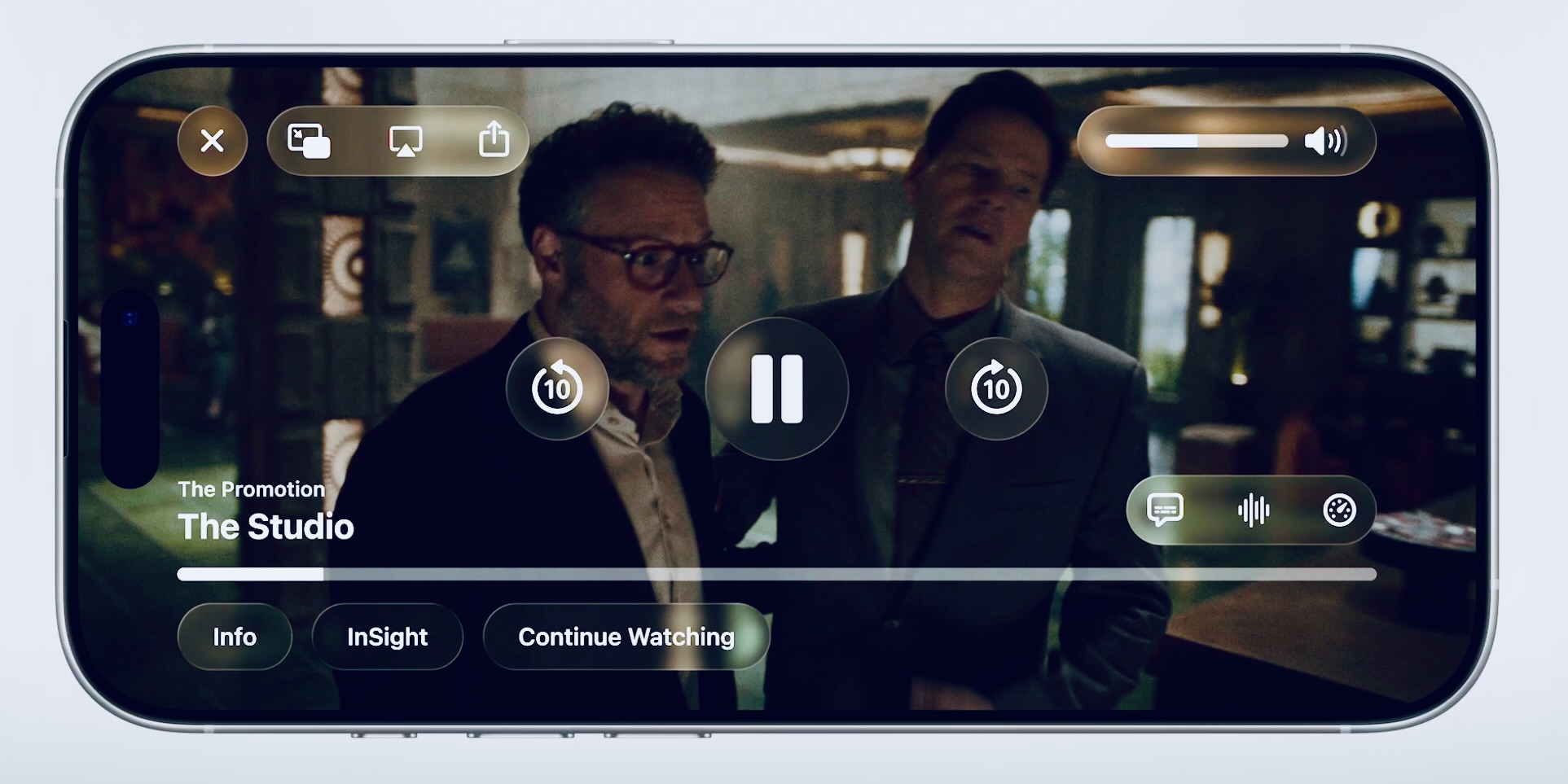
Nielsen’s heuristic about speaking the users’ language and using familiar metaphors is largely embraced by Liquid Glass. Apple explicitly grounded this design in a real-world material metaphor: glass. Buttons, menus, and windows behave like pieces of glass, they have specular highlights and reflections as if light is hitting a physical surface, and they distort what’s behind them just like real glass would.
This use of a familiar material can make the interface more intuitive in some ways: users understand that a translucent glassy panel is a separate layer on top of other content (just as a glass panel in real life would partially show what’s behind it). By “mimicking the look of real-world glass” with refraction and shine, Apple is leveraging a visual analogy that aligns with real-world expectations, fulfilling the metaphor aspect of this heuristic. For example, the new sidebar design on Mac literally behaves like a glass sheet over the window: it appears to magnify or blur content beneath it, reinforcing the idea that it’s an overlay. This real-world congruence can improve users’ mental model of the UI’s layers and navigation.
That said, Apple is careful not to reintroduce heavy skeuomorphism (no pseudo-3D knobs or leather textures, for instance). Liquid Glass is more about a subtle real-world feel (depth, light behavior) within a modern interface. As long as these effects remain subtle and don’t impede functionality, they align well with the principle of making digital interfaces behave in user-familiar ways. Notably, Apple’s design chief even referenced how Liquid Glass was born from “close collaboration” of design and engineering to get the physics right determining how important the real-world simulation was to them.
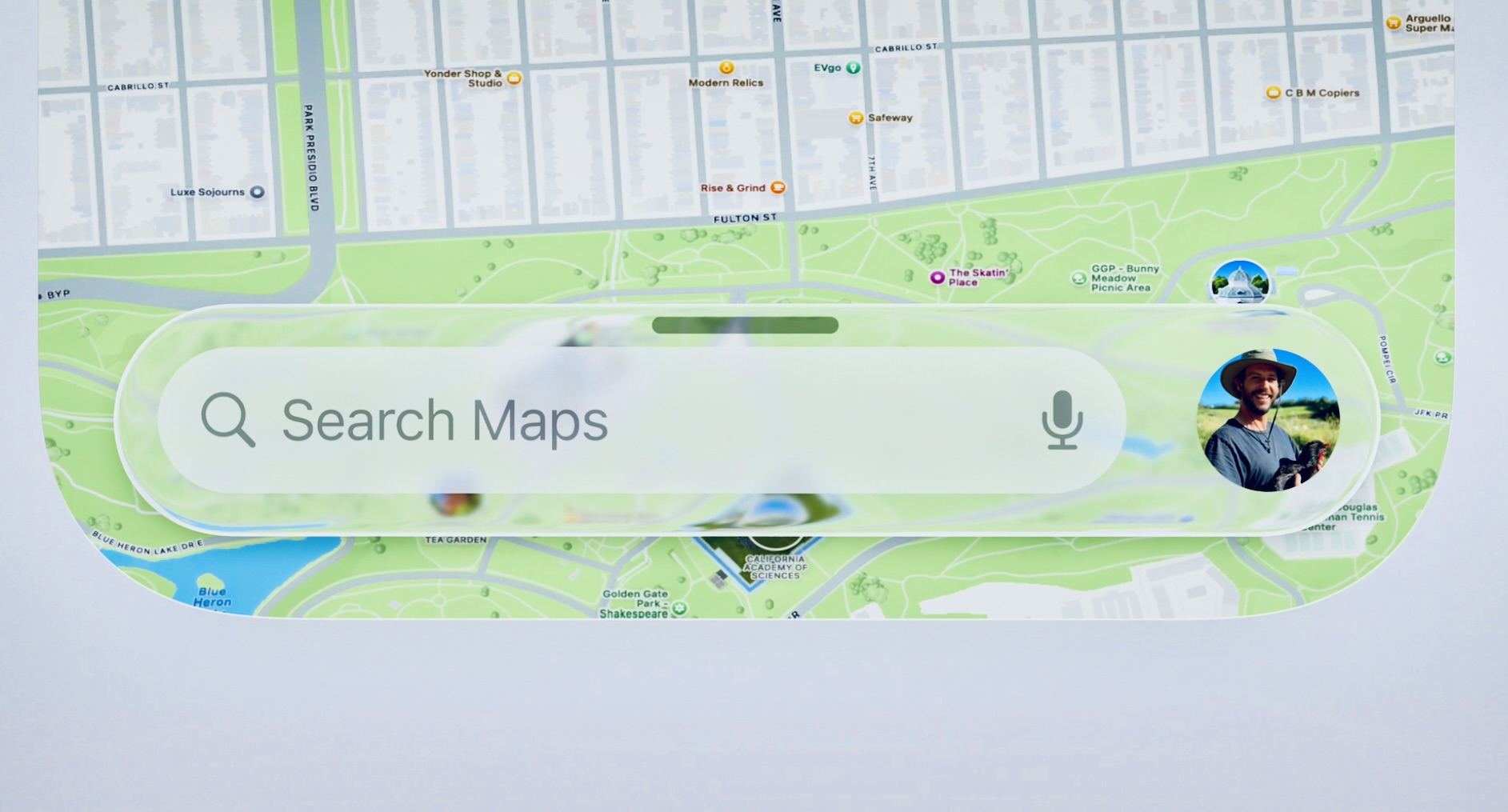
Apple has a strong track record with this heuristic. Remember, iOS 7’s flat design was all about stripping away excess visual clutter. With Liquid Glass, Apple is trying to have it both ways: more depth and animation, yet still a focus on simplicity and content. In many respects, Liquid Glass aligns with minimalist principles. The design intentionally de-emphasizes background and inactive elements by using blur and translucency to “soften” them.
This means when a dialog is on screen, what’s behind it is blurred out or faint, so your attention is drawn to the task at hand. Controls made of Liquid Glass often “give way” when not needed – for example, a toolbar might literally fade or shrink when content is front and center. These techniques reduce perceived clutter, letting content breathe. Apple’s own wording is that the new design brings “greater focus to content” and is “instantly familiar” without extraneous ornamentation. Furthermore, the use of consistent, rounded geometry (buttons now align with device corner radii) and a refined color palette maintains a clean aesthetic. On the flip side, critics have noted that the added glassy effects could introduce a new kind of visual complexity.
The shine, motion, and color shifts in Liquid Glass, if overused, might become what one designer called “sensory hell” – basically visual noise. For instance, having a semi-transparent layer with a moving background behind it and text on top is inherently more complex than a solid, flat background. Some beta users felt Apple “just made the UI less opaque” and questioned if that truly improves the experience. The challenge is to keep these effects subtle. Apple seems aware of this, as a design blog noted Liquid Glass “creates a richer UI that reacts to context while avoiding visual noise”.
In essence, Apple is walking a line: the interfaces are visually impressive but need to remain uncluttered and accessible. If Apple succeeds, Liquid Glass could enhance aesthetics without violating minimalism (because elements only stand out when needed). If they misstep, it could turn into a flashy distraction. At this stage, it’s fair to say the intent aligns with minimalist design (focusing attention, hiding chrome), but execution will determine if the end result stays minimalist or tips into excess.
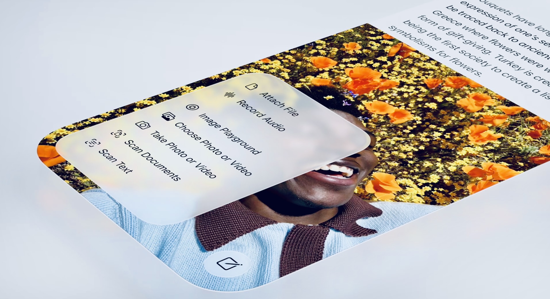
One clear win for Liquid Glass is cross-platform consistency. By rolling the same design language out to iOS, macOS, iPadOS, watchOS, and tvOS simultaneously, Apple is enforcing consistency across its ecosystem. Users benefit from this standardization: an app’s icon or a toggle switch will look and behave similarly whether you’re on an iPhone or a Mac, reducing the learning curve. Apple’s Human Interface Guidelines and developer APIs were updated so third-party apps can also adopt Liquid Glass, ensuring consistency within apps too. Nielsen’s principle also talks about following conventions – here Apple isn’t breaking known UI conventions; they are mostly reskinning them. All interactive components that users expect (buttons, links, scroll bars, etc.) still exist and in standard locations, just with a new coat of paint. In fact, Apple was careful to maintain familiar layouts and icons (no drastic icon redesign, for example).
This means internal consistency with past Apple design is partly preserved – e.g., iOS 26 still uses the fundamental flat icon style introduced in iOS 7. Liquid Glass is more evolutionary than revolutionary, so users won’t have to relearn everything (Apple even mentioned that despite the new look, it’s “instantly familiar” to navigate). There is a minor risk that within the UI, dynamic changes could affect consistency: for example, if a button morphs shape when you press it, does that break predictability? Apple’s approach seems to ensure these transformations are consistent and purposeful (a control might expand to show more options, but it’s following a consistent behavior rule). Additionally, because Liquid Glass uses real-time rendering, older devices that can’t render the fancy effects will fall back to simpler visuals.
That introduces a platform inconsistency (not all users get the exact same visuals), but Apple handles it by degrading gracefully rather than altering functionality. In summary, Liquid Glass largely respects consistency and standards: it’s a unified standard look for Apple, applied consistently, and it sticks to known Apple UI patterns (just restyled). Users coming from earlier versions should feel at home, just with a more polished interface – as one observer put it, the redesign “represents consistency rather than true innovation”.
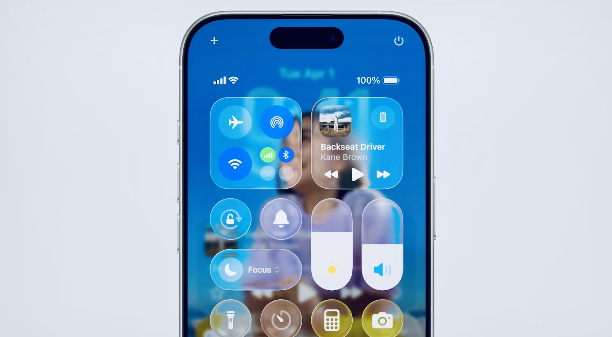
While not explicitly in Nielsen’s original ten, accessibility and user preference support are critical usability aspects that Apple considered. The Liquid Glass design was built to accommodate various user needs. For one, Accessibility settings like high-contrast, Reduce Transparency, and Reduce Motion are fully supported. Apple has ensured that turning on these settings will tone down or remove the glass effects as needed. This means users who find the translucency or animations distracting can regain a simpler interface, honoring the principle of user control. For example, an option exists to disable transparency system-wide, which would likely replace Liquid Glass panels with solid backgrounds for better contrast – a win for users with low vision or those who just prefer simplicity.
Additionally, the system font and elements in Liquid Glass adapt to Dynamic Type and different contrast modes, so legibility and scale can be adjusted by the user. This alignment with accessibility heuristics ensures the flashy new design doesn’t lock anyone out – it’s essentially an enhancement on top of a still-accessible UI. On the flexibility side, Apple introduced personalization options (like the tinted vs. clear look on Mac) which let users choose what suits them. That empowers power users to tweak the aesthetic – a form of flexibility that can improve user satisfaction. One potential conflict in terms of user control is that certain dynamic behaviors like auto-shrinking toolbars are enforced by the design; users might not have a toggle to keep the UI static if they preferred.
This could inconvenience a minority of users who dislike auto-hiding UI. However, given Apple’s history, these behaviors are usually subtle and well-tested and often there’s a gesture to retrieve a hidden control, e.g. pull down to see the address bar.
Finally, error prevention and feedback should remain mostly unaffected by the new design – except that, as mentioned, any drop in clarity (like a warning message being less noticeable on a translucent background) could impair how clearly the system communicates problems. Apple will need to use techniques like color cues (e.g. a red tint on errors) to preserve feedback visibility in the glass UI.
Encouragingly, Apple’s design philosophy for Liquid Glass heavily emphasizes clarity and focus, so the hope is that things like alerts and statuses are even more visible (by dimming what’s behind them, etc.), not less. We’ve already seen that context-driven visibility can guide user attention effectively if tuned right.
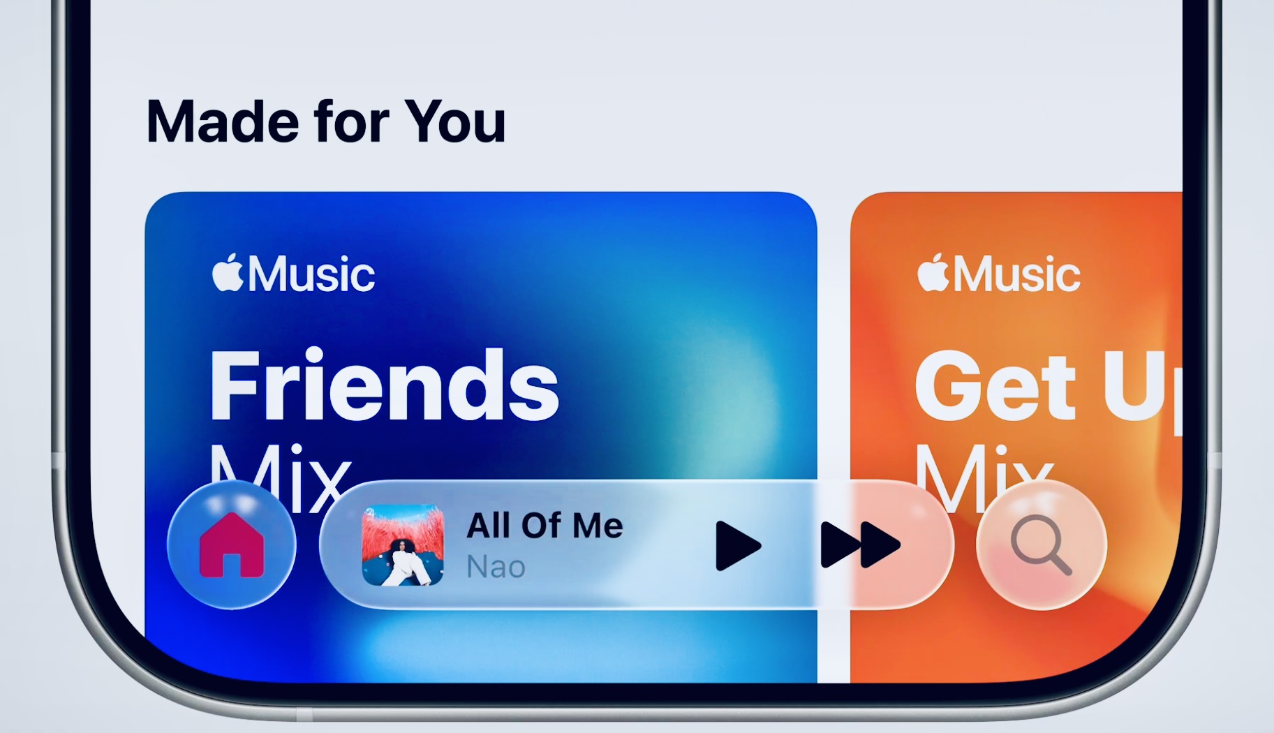
Liquid Glass brings several usability benefits: it adds depth cues that help users orient themselves, it unifies and simplifies the look across devices (consistency), and it strives to keep the interface lightweight by hiding or blending ancillary elements. It aligns with modern minimalist ideals (content-first design) and uses a universally understood metaphor (glass) to make layers intuitive.
Apple has also built it to respect accessibility needs, which is a strong alignment with usability best practices. On the other hand, the design poses some usability risks: chiefly, the potential for reduced legibility and discoverability if transparency and motion are overdone. The early feedback about hard-to-read text on busy backgrounds highlights that conflict.
Essentially, Liquid Glass needs careful calibration – too little and it’s just a cosmetic change; too much and it could undermine the “Don’t make me think” ease-of-use principle. At this stage, many critiques (and comparisons to Microsoft’s old Aero Glass) point out that Apple must prove this isn’t just eye-candy at the cost of practicality.
Apple’s Liquid Glass design is a bold mix of form and function. As a visual update, it’s undeniably effective in making the Apple ecosystem feel fresh, unified, and “futuristic.” It succeeds in creating a more immersive, content-focused experience – users can enjoy a lively, modern interface that still feels familiar. When evaluated against usability heuristics, Liquid Glass shows that Apple hasn’t abandoned principles like simplicity or feedback; rather, they’re attempting to enhance the user experience with more delight and dimensionality without sacrificing usability.
There are clear positives: improved contextual awareness (the UI subtly guides your attention), consistent multi-device design, and a beautiful aesthetic that can even make using the device more fun to use Alan Dye’s words, even simple interactions feel “magical” with the new animations.
However, the true effectiveness of Liquid Glass will depend on refinement. Some aspects currently conflict with usability best practices – most notably, issues with contrast and readability in certain scenarios need to be ironed out. If Apple addresses these (and they have the opportunity, since the design is in beta and Apple has time to adjust before public release), Liquid Glass could strike a great balance of beauty and usability. The design’s alignment with many established heuristics – like matching real-world cues, maintaining consistency, and supporting minimalist focus – suggests that it canenhance UX if executed with care.
For UX professionals and design-aware users, Liquid Glass is an interesting case study: it shows Apple pushing the envelope aesthetically while largely adhering to user-centric design principles. It demonstrates how visual innovationneeds to be married to usability standards. As of now, reception is mixed – some love the new look, others worry it’s form over function, but Apple’s iterative approach means the final product will likely be more polished.
In conclusion, if Apple manages the fine details (ensuring text and controls are always discernible, motions are suitably restrained, and users retain control where needed), Liquid Glass will be a effective design evolution that elevates the user experience. It will make interfaces more engaging and dynamic without breaking what made them usable in the first place. In Apple’s ideal scenario, Liquid Glass will truly “lay the foundation for new experiences” going forward, enhancing usability by making interfaces both intuitive and enjoyable – essentially proving that an interface can be transparent in look while remaining transparent in use i.e. easy to navigate.






1 comment